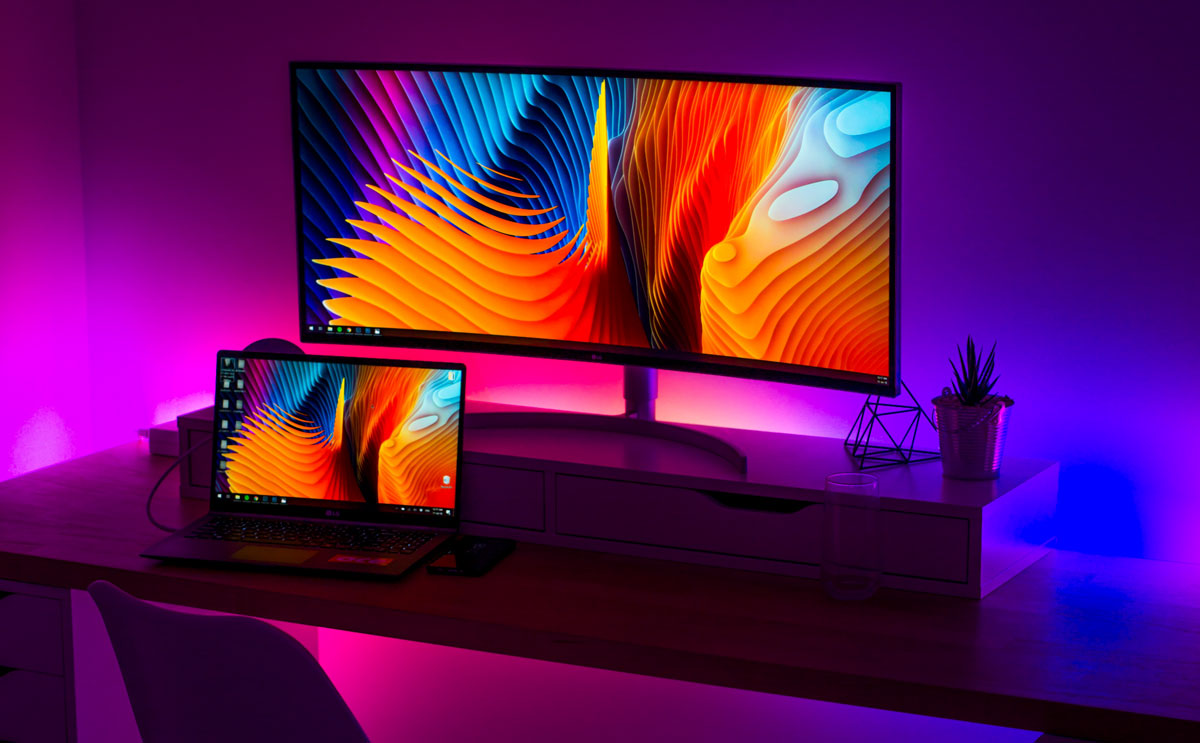
What is my screen resolution?
We recently built a free tool that can give you the exact dimensions of your screensize. These numbers represent the viewport size of your current screen, which is the visible display area of your screen. This is often slightly smaller than your screen resolution. A web design viewport is defined as a rectangular area (measured in pixels) that is displayed on the screen and determines how the content is arranged and where to scroll through the text wrappers or windows to see the entire web page.
Is the viewport the same as the screen resolution?
For most devices, the resolution/size of the screen is the same as the viewport size. This is true for most desktop computers and laptops, but is almost never true for mobile devices and tablets! Many phone browsers scale web pages to a larger screen width to put them on the screen. This is sometimes called overview mode. These browsers allow the user to zoom in and out of the pages to see the bit they want to see. For example, while the screen width of a device can be 320px, the viewport can be 980px wide. In this case, a web page designed for 980px or less will fit across the entire screen. I am typically using 1000px and 690px as the main breakpoints on websites I design as that seems to cover a lot of good ground for most modern devices.
Screen resolution is not a useful indicator for browser window size.
Desktop screens have increased significantly over the last decade, but browser display screens (the visible area in the browser window) pretty much have not. A little while back, CSS-Tricks discovered that only 1% of users have full screen navigation. While only 9% of visitors to this site had a screen width of less than 1200px. Their take is that even though lots of users run big monitors these days, not all of them are viewing websites in ‘full screen resolution’, therefore the viewport size of the website is much smaller than the screen resolution of their monitor.
What is my screensize?
Where the confusion begins with screensizes and viewports is usually due to phone manufacturers misleading consumers:
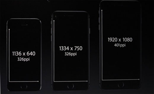
For a lot of devices, the resolution specified by the manufacturer often doesn’t refer to PPI (pixels per inch) which is a better way to think about resolution. You can see this by looking at iPhone screen sizes for the past few years. The physical dimensions of the screen have hardly changed (see the CSS widths of iPhone 6 compared to iPhone X), but the resolution has increased almost 60%. So what you’re getting is a new device with the same physical size of an older, lower resolution device, but they have jammed much more PPI in to the screen. Following?
Now you’ve read a little more about screen resolutions and device viewports and hopefully I have answered your what is my screensize question? There’s some more good info if you’d like to keep reading on these topics over at the Android website.
If you’d like a detailed list of different devices’ viewport sizes, pixel dimensiosn and CSS widths I’ve compiled all the info I can on this viewports list.
Phone Screen Dimensions
In today’s world, there are many devices for people to choose from, and it can be daunting if you try to place and build for the best experience on all devices. However, when designing websites and mobile devices, it’s important to be aware of the most popular phone screen sizes and resolutions so you can match your design to your screen viewers. An optimized and responsive website makes the user experience easier and ultimately more enjoyable for your audience.
Phone screen size vs. viewing area
When buying a device, both the screen size and resolution listed in the specifications are often shown. Screen sensitivity is the measurement of the screen diagonally, in inches. It should not be confused with resolution, which is the number of pixels on the screen, often shown in width by height (i.e. 1024×768). Because devices with the same screen size can have very different resolutions, developers use viewports when creating mobile-friendly pages. Viewports have smaller versions of the resolution, allowing websites to be viewed more consistently on different devices. Viewports are often more standardized and have lower resolution versions than resolutions.
While desktop and laptop monitors are horizontal resolution (higher), many mobile devices can be rotated to display websites in both horizontal and vertical (over the width) orientation. This means that designers and developers must design with these differences in mind. While desktop and laptop monitors are horizontal (over the width), many mobile devices can be rotated to display sites in both horizontal and vertical (over the width) orientation. This means that designers and developers must design with these differences in mind.
Coding for different phone screen dimensions
It would be nearly impossible for companies to design each device individually. Instead, developers often group responsive designs together:
Grouping styles into the most common sizes for phones, tablets, and desktop computers. In this case, anything larger than 7 inches is usually displayed at desktop resolution or… Use breakpoints (defined by the pixel width that the screen will adjust to fit the screen size) depending on the design and location. Sometimes a developer can combine both methods if they deem it necessary. It is recommended that you start by grouping typical device sizes together.
If you are a developer and want to create the styles needed to work with mobile or responsive styles, we have included a CSS snippet below that may help. It is important to note that these breakpoints are not fixed for all sites and should only be used as a guide to get you started.
Phone Screen Dimensions Table
What are the phone screen dimensions of popular phone and mobile devices? We’ve put together a very comprehensive list of phone screen dimensions which can help you with designing webpages for the various devices. Below is a condensed version of the list, but we provide pixel density, physical CSS and PPI (pixels per square inch).
| name | phys. width |
phys. height |
css width |
css height |
|
|---|---|---|---|---|---|
| Amazon Kindle Fire | 600 | 1024 | 600 | 1024 | |
| Amazon Kindle Fire HD 7 | 800 | 1280 | 480 | 800 | |
| Amazon Kindle Fire HD 8.9 | 1200 | 1920 | 800 | 1280 | |
| Apple iPad 1, 2 | 768 | 1024 | 768 | 1024 | |
| Apple iPad 3, 4, Air, Air2 | 1536 | 2048 | 768 | 1024 | |
| Apple iPad mini | 768 | 1024 | 768 | 1024 | |
| Apple iPad mini 2, 3, 4 | 1536 | 2048 | 768 | 1024 | |
| Apple iPad Pro | 2048 | 2732 | 1024 | 1366 | |
| Apple iPad Pro 9.7 | 1536 | 2048 | 768 | 1024 | |
| Apple iPhone 3 | 320 | 480 | 320 | 480 | |
| Apple iPhone 4 | 640 | 960 | 320 | 480 | |
| Apple iPhone 5 | 640 | 1136 | 320 | 568 | |
| Apple iPhone 6+, 6s+, 7+, 8+ | 1080 | 1920 | 414 | 736 | |
| Apple iPhone 6, 6s | 750 | 1334 | 375 | 667 | |
| Apple iPhone 7, iPhone 8 | 750 | 1334 | 375 | 667 | |
| Apple iPhone X | 1125 | 2436 | 375 | 812 | |
| Apple iPod Touch | 640 | 1136 | 320 | 568 | |
| Asus Nexus 7 (v1) | 800 | 1280 | 604 | 966 | |
| Asus Nexus 7 (v2) | 1080 | 1920 | 600 | 960 | |
| Blackberry Classic | 720 | 720 | 390 | 390 | |
| Blackberry Leap | 720 | 1280 | 390 | 695 | |
| Blackberry Passport | 1440 | 1440 | 504 | 504 | |
| Blackberry Playbook | 600 | 1024 | 600 | 1024 | |
| Blackberry Q10 | 720 | 720 | 346 | 346 | |
| Blackberry Torch 9800 | 360 | 480 | 360 | 480 | |
| Blackberry Z10 | 768 | 1280 | 384 | 640 | |
| Blackberry Z30 | 720 | 1280 | 360 | 640 | |
| Google Glass | 640 | 360 | 427 | 240 | |
| HTC 8X | 720 | 1280 | 320 | 480 | |
| HTC Evo 3D | 540 | 960 | 360 | 640 | |
| HTC Nexus 9 | 1538 | 2048 | 768 | 1024 | |
| HTC One | 1080 | 1920 | 360 | 640 | |
| Lenovo K900 | 1080 | 1920 | 360 | 640 | |
| LG G3 | 1440 | 2560 | 360 | 640 | |
| LG G4 | 1440 | 2560 | 360 | 640 | |
| LG G5 | 1440 | 2560 | 360 | 640 | |
| LG G Pad 8.3 | 1200 | 1920 | 600 | 960 | |
| LG Nexus 4 | 768 | 1280 | 384 | 640 | |
| LG Nexus 5 | 1080 | 1920 | 360 | 640 | |
| LG Optimus G | 768 | 1280 | 384 | 640 | |
| Microsoft Lumia 620 | 480 | 800 | 320 | 480 | |
| Microsoft Lumia 830 | 720 | 1280 | 320 | 480 | |
| Microsoft Lumia 900 | 480 | 800 | 320 | 480 | |
| Microsoft Lumia 920 | 768 | 1280 | 320 | 480 | |
| Microsoft Lumia 925 | 768 | 1280 | 320 | 480 | |
| Microsoft Lumia 1020 | 768 | 1280 | 320 | 480 | |
| Microsoft Lumia 1520 | 1080 | 1920 | 432 | 768 | |
| Microsoft Surface | 768 | 1366 | 768 | 1366 | |
| Microsoft Surface Pro | 1080 | 1920 | 720 | 1280 | |
| Microsoft Surface Pro 2 | 1080 | 1920 | 720 | 1280 | |
| Microsoft Surface Pro 3 | 1440 | 2160 | 1024 | 1440 | |
| Motorola Nexus 6 | 1440 | 2560 | 412 | 690 | |
| Pantech Vega n°6 | 1080 | 1920 | 360 | 640 | |
| Samsung Galaxy Nexus | 720 | 1200 | 360 | 600 | |
| Samsung Galaxy Note | 800 | 1280 | 400 | 640 | |
| Samsung Galaxy Note 2 | 720 | 1280 | 360 | 640 | |
| Samsung Galaxy Note 3 | 1080 | 1920 | 360 | 640 | |
| Samsung Galaxy Note 4 | 1440 | 2560 | 360 | 640 | |
| Samsung Galaxy Note 8 | 1440 | 2960 | 360 | 740 | |
| Samsung Galaxy Note 9 | 1440 | 2960 | 360 | 740 | |
| Samsung Galaxy Note 10 | 1080 | 2280 | 360 | 718 | |
| Samsung Galaxy Note 10+ | 1080 | 2280 | 360 | 718 | |
| Samsung Galaxy S | 480 | 800 | 320 | 533 | |
| Samsung Galaxy S2 | 480 | 800 | 320 | 533 | |
| Samsung Galaxy S3 | 720 | 1280 | 360 | 640 | |
| Samsung Galaxy S3 mini | 480 | 800 | 320 | 533 | |
| Samsung Galaxy S4 | 1080 | 1920 | 360 | 640 | |
| Samsung Galaxy S4 mini | 540 | 960 | 360 | 640 | |
| Samsung Galaxy S5 | 1080 | 1920 | 360 | 640 | |
| Samsung Galaxy S6 | 1440 | 2560 | 360 | 640 | |
| Samsung Galaxy S7, S7 edge | 1440 | 2560 | 360 | 640 | |
| Samsung Galaxy S8 | 1440 | 2960 | 360 | 740 | |
| Samsung Galaxy S8+ | 1440 | 2960 | 360 | 740 | |
| Samsung Galaxy S9 | 1440 | 2960 | 360 | 740 | |
| Samsung Galaxy S9+ | 1440 | 2960 | 360 | 740 | |
| Samsung Galaxy S10 | 1440 | 3040 | 360 | 740 | |
| Samsung Galaxy S10+ | 1440 | 3040 | 360 | 740 | |
| Samsung Galaxy Tab 2 10″ | 800 | 1280 | 800 | 1280 | |
| Samsung Galaxy Tab 2 (7″) | 600 | 1024 | 600 | 1024 | |
| Samsung Galaxy Tab 3 10″ | 800 | 1280 | 800 | 1280 | |
| Samsung Galaxy Tab (8.9″) | 800 | 1280 | 800 | 1280 | |
| Samsung Nexus 10 | 1600 | 2560 | 800 | 1280 | |
| Sony Xperia P | 540 | 960 | 360 | 640 | |
| Sony Xperia S | 720 | 1280 | 360 | 640 | |
| Sony Xperia Z | 1080 | 1920 | 360 | 640 | |
| Sony Xperia Z3 | 1080 | 1920 | 360 | 598 | |
| Xiaomi Mi 3 | 1080 | 1920 | 360 | 640 | |
| Xiaomi Mi 4 | 1080 | 1920 | 360 | 640 | |
| Xiaomi Redmi Note 5 | 1080 | 2160 | 393 | 786 | |
| ZTE Grand S | 1080 | 1920 | 360 | 640 | |
| ZTE Open (Firefox OS) | 480 | 720 | 320 | 480 |

